VISUALS FOR VISIBILITY
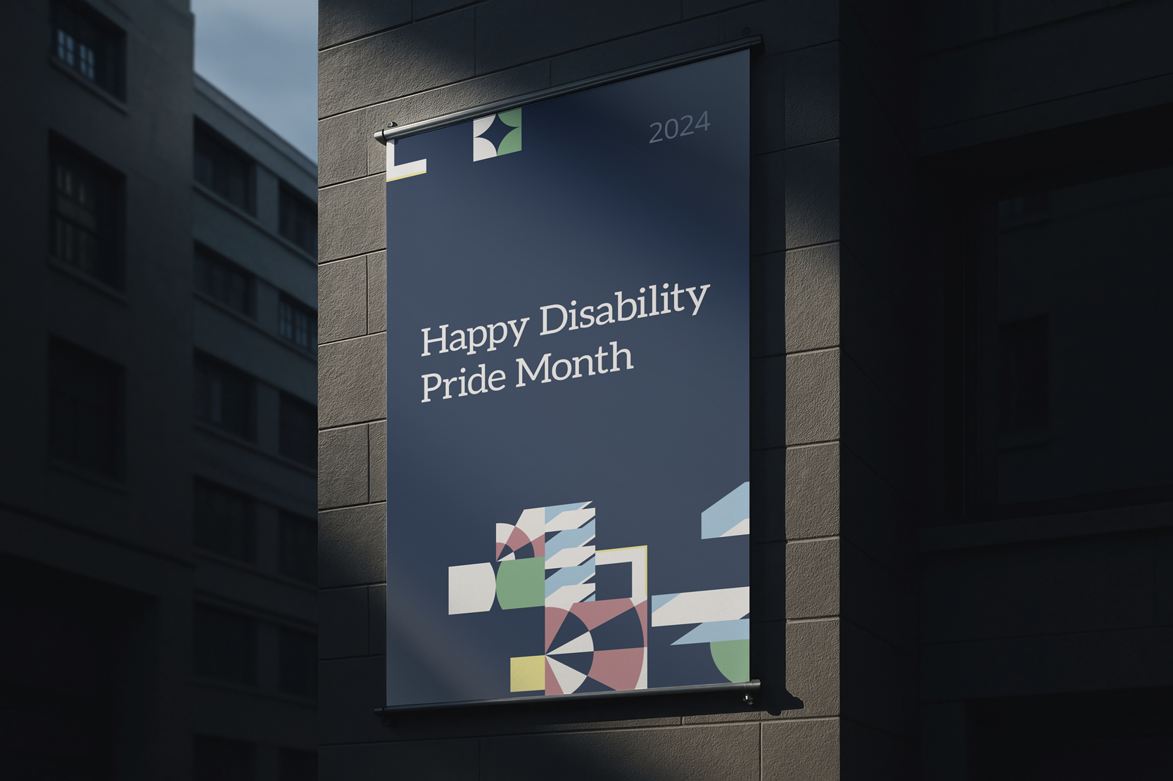
INFOA modular identity system inspired by the Disability Pride Flag, engineered to celebrate Disability Pride Month with strategic intent. Tasked with creating an identity for Illuminate, I developed a comprehensive framework that honoured the diverse lived experiences of disabled individuals through symbolic, motion-driven storytelling.
YEAR2024
CLIENTILLUMINATE, INFORMA
ROLEART DIRECTOR AND LEAD MOTION DESIGNER


STORIES IN FULL COLOUR
To root the system in the company’s visual world, I integrated Informa Blue across the palette. It provided contrast for accessibility while reinforcing the organisation’s visible support of its Disabled community.
White speaks to invisible and undiagnosed disabilities. It is subtly woven throughout all elements to remind us of the presence of unseen experiences.

Red symbolises physical disability. I used layered circular forms to reflect strength, repetition, and motion. A pattern evoking both muscle memory and the wheel of a wheelchair.

Gold in the flag represents neurodivergence. Interlocking, complex forms show the beauty of diverse thought patterns and non-linear thinking.

Blue reflects mental illness. Wave-like movements combined with sharp angles illustrate the dynamic, emotional highs and lows.

Green is for sensory disabilities. I used patterns inspired by braille to echo tactile learning, with a focus on clarity and empowerment.